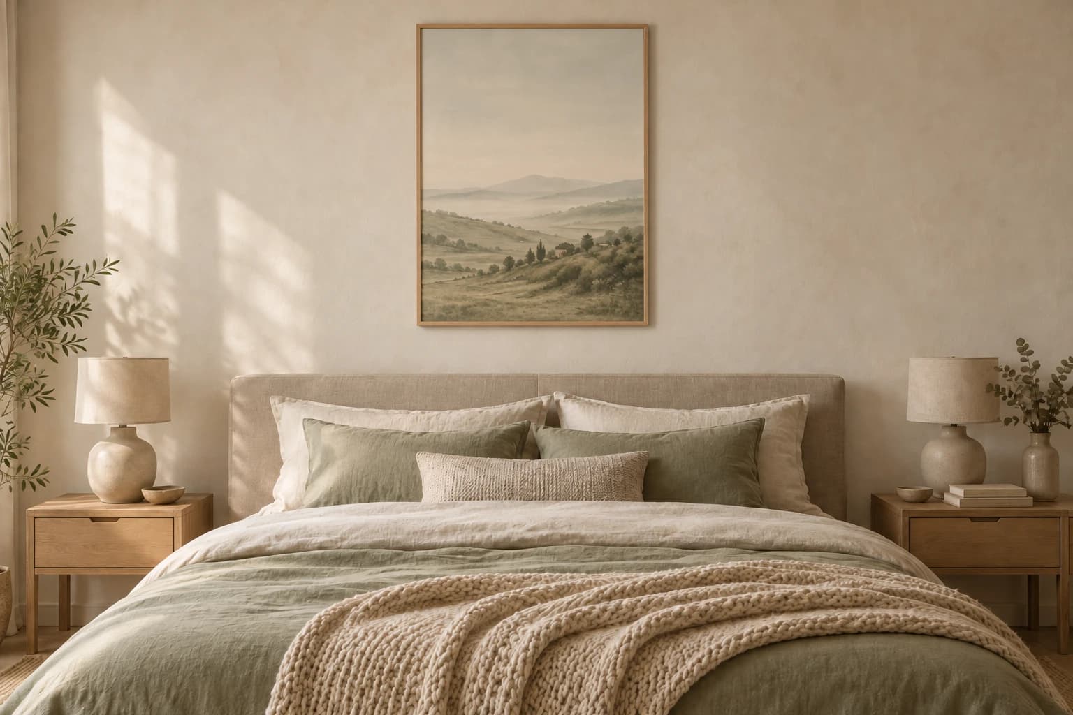
Most rooms in a home have several jobs. The living room has to handle both everyday life and guests, and the kitchen has to be practical first. The bedroom really has just one: helping you relax. That makes it one of the easiest rooms to make cosier with posters, as long as you choose motifs that support the calm instead of competing with it.
You don't need to paint or renovate. One or two well-chosen posters above the bed can change how the whole room feels. If you want to go straight to the motifs, browse our bedroom posters. If you want to know how to choose, read on.
What makes a good bedroom poster?
A good bedroom poster is one you can look at every night without tiring of it, and without it keeping you awake. It's less about style and more about pace: the motif should be easy to rest your eyes on.
- Muted colours rather than strong contrasts. A motif in sand and grey feels calmer than one in black and bright red, even if both are beautiful.
- Space in the composition. Motifs with plenty of sky, water or soft surfaces give the eye somewhere to land.
- Few details. Busy motifs with lots going on suit a hallway or living room better, where you walk past them.
- Something that means something to you. A landscape from a place you love, or a flower you like, makes the room personal without making it cluttered.
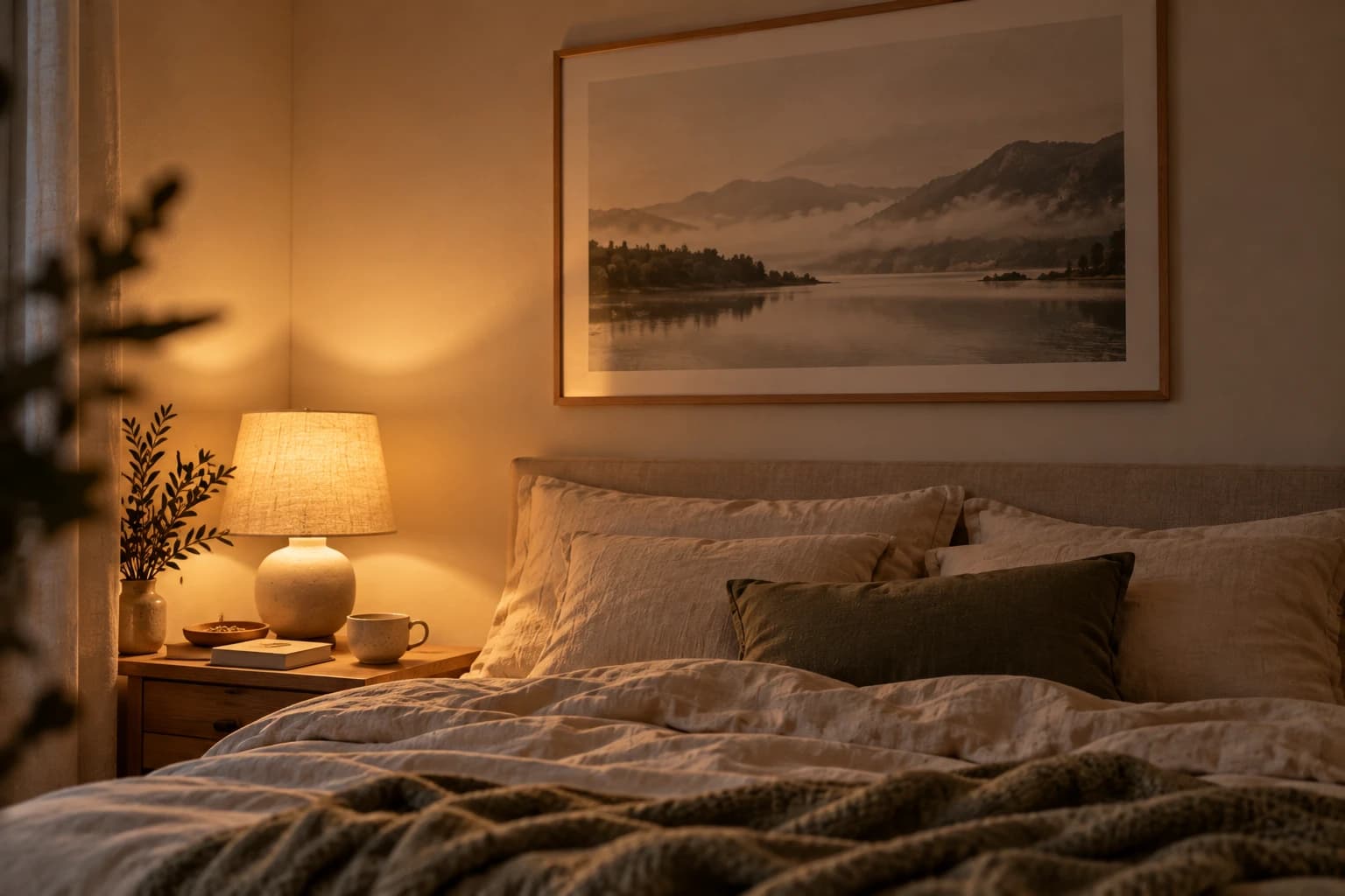
Remember that you see the poster in two very different lights: warm lamplight in the evening and cool daylight in the morning. Motifs in earth tones and natural colours handle both well.
Colours that create a calm feel
The colours on your wall affect the mood more than you might think. In the bedroom, light, warm and muted colours work best:
- Beige, sand and cream are the safest choices. They add warmth without taking over, and go with almost any bedding. Browse our beige posters.
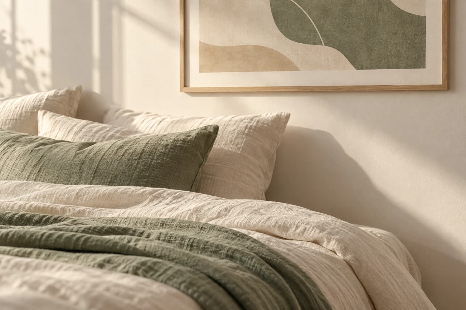
- Soft green and sage bring nature indoors and feel fresh without turning cold.
- Dusty blue and grey give a cool, calm feel. Lovely in a bright, sunny room.
- Terracotta and muted pink add warmth in small doses, ideally as a detail in an otherwise light motif.
A simple rule: let the poster pick up one colour that's already in the room, say in the bedding, a throw, the curtains or a rug. The whole room then hangs together, even though the motif is new. Large areas of neon, saturated red or hard black-and-white contrast work better elsewhere in the home than right above your pillow.
Best placement: above the bed, the dresser or in pairs
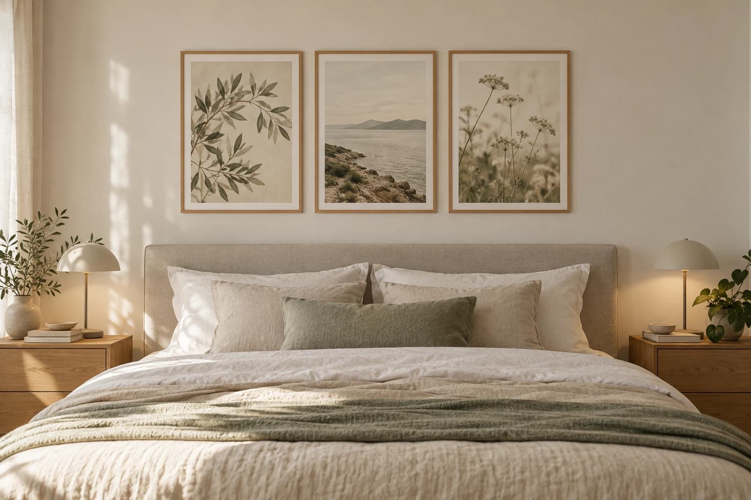
The classic spot is above the bed, and that's where a poster does the most for the room. The headboard acts as a natural base, and the poster becomes the room's focal point. Hang the bottom edge 20–30 cm above the headboard, so the bed and the picture read as one unit instead of the picture floating high up the wall.
But there are good alternatives:
- Above the dresser: Here you can choose a slightly more personal or colourful motif, since you see it from a distance. Let the picture cover about two thirds of the dresser's width.
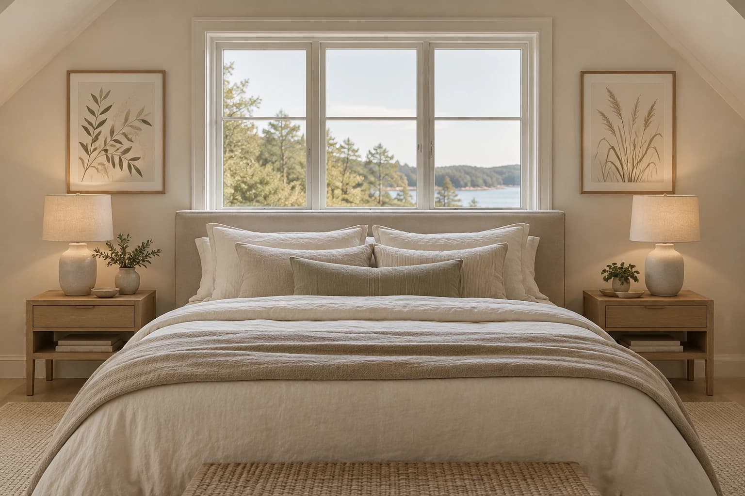
- In pairs above the bedside tables: Two posters of the same size, one above each bedside table, give a symmetrical, hotel-like look. It's a good solution if there's a window or sloping ceiling above the headboard.
- On the wall you see from the bed: This is the motif you see first thing in the morning. Choose something that makes you happy.
Wondering what works in the rest of your home? See our wall art for every room.
How to choose the right size above the bed
The most common mistake is going too small. A small poster alone above a wide double bed easily looks accidental. Start from the width of the bed, and let the picture or group of pictures cover about two thirds of it.
- Double bed (150–180 cm): one poster in 50x70, or two in 40x50 side by side.
- Wide bed or large headboard (180 cm and up): two in 50x70, or one 70x100 if the motif is landscape.
- Single bed (90–120 cm): one poster in 40x50 is usually enough.
- Above the bedside tables: 30x40 or 40x50, depending on how wide the tables are.
All our motifs come in five sizes, from 21x30 to 70x100. Our poster size guide shows them to scale, with measurements and prices.
Matte or glossy in the bedroom
Many people wonder whether to choose matte or glossy paper. We print on 200 g/m² paper with two finishes: matte and silk. Silk has a subtle sheen, but it isn't mirror-glossy like classic photo paper.
In the bedroom, matte is usually the best choice. Matte paper doesn't throw back light from the ceiling lamp or bedside lamp, and the motif reads as a calm surface from every angle. It also gives a softer look that sits well with textiles and natural materials.
Silk can be the right choice if the motif is dark or has a lot of depth, like an evening landscape or a photograph with strong colours, and the room has no light sources pointing straight at the wall. Read more about the difference in our guide to paper and print quality.
Motifs that work: nature, flowers and soft abstract shapes
There's no single right answer, but three kinds of motifs keep showing up in bedrooms that feel calm:
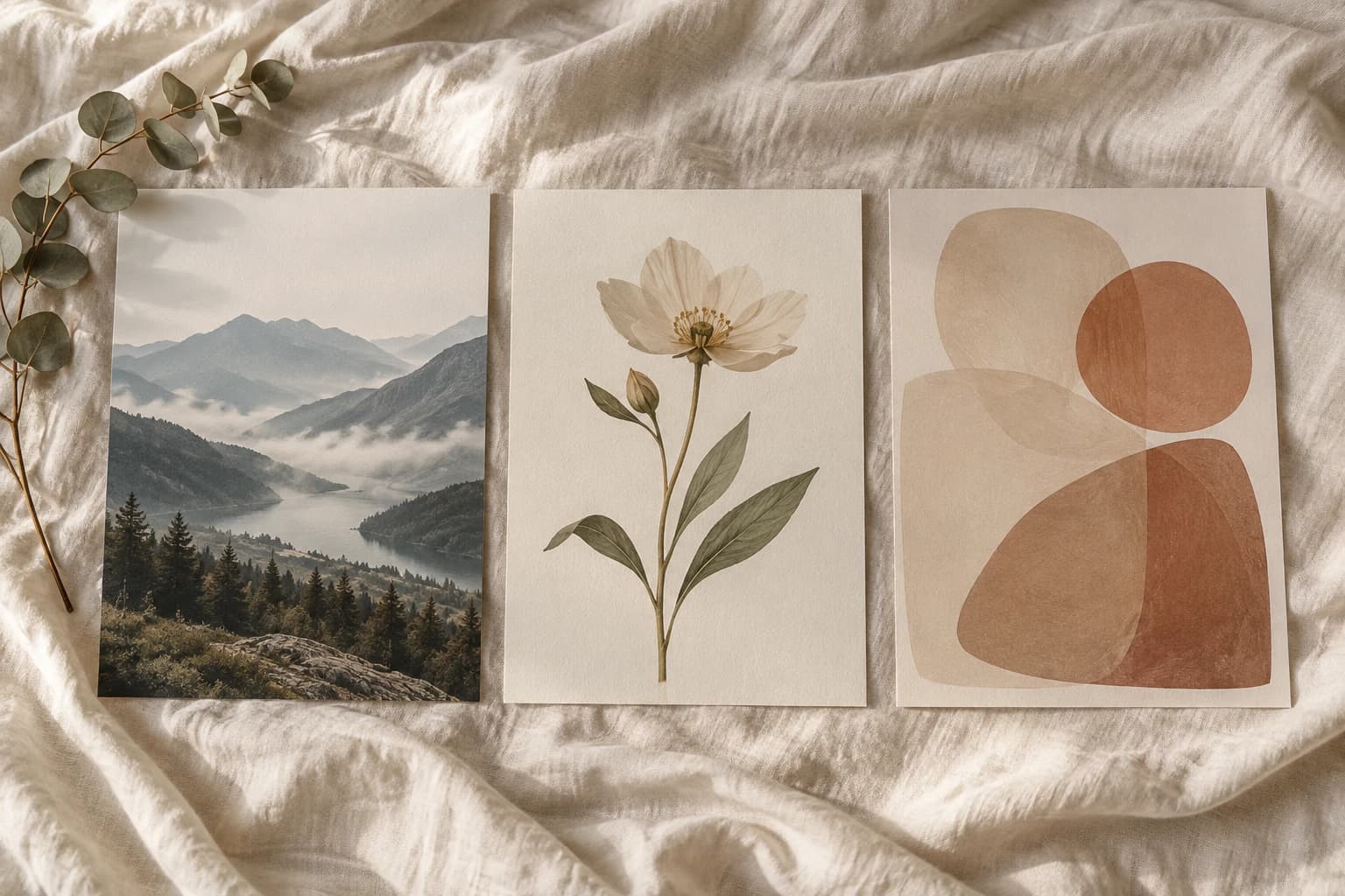
- Nature and landscapes: Mountains in morning mist, a still sea, a forest or a beach add depth and calm. Cool landscapes suit bright rooms, while warm sunsets add cosiness.
- Flowers and botanicals: Simple flowers, branches and leaves in muted colours add life without becoming busy. They also work well in pairs.
- Soft abstract shapes: Organic forms, arches and fields of earth tones give a modern, calm look. Abstract motifs are easy to combine because they don't tell a specific story.
Be a little careful with busy city scenes, portraits that look straight at you, and typography with lots of text. They have their place, just perhaps not right above the bed.
How to combine two or three posters
Two or three posters above the bed are a nice alternative to one large one, and give the wall more rhythm. To make it look intentional rather than accidental, a few rules are enough:
- Pick a common thread: the same colour palette, the same type of motif or the same style. Two nature motifs in the same tone work better than one nature motif and one abstract in completely different colours.
- Use the same size and the same frame for a calm, symmetrical look. Two in 40x50 or three in 30x40 are classic layouts above a double bed.
- Keep 5–8 cm between frames, and line up either the top edges or the centre line.
- Centre the group above the bed, not above the middle of the wall.
If you're building a bigger wall with several pictures, you'll find layouts and measurements in our guide to making a gallery wall.
In short
Good bedroom posters have muted colours, calm motifs and the right size for the bed. Choose one 50x70 or two 40x50 above a double bed, hang them 20–30 cm above the headboard, and pick matte paper if the room has lamps shining at the wall. You'll have a bedroom that feels cosier without lifting a paintbrush. Find your motifs among our bedroom posters.